On taking your hobbies seriously

At a ball in New Orleans in 1802, the ex-governor Vidal's son insisted on dancing "English contredances," which were easier, or perhaps simply more to his taste, than the French ones. When the young Vidal pushed his privilege too far, and angry shouting match ensued between his entourage and the French:

—Contredanse anglaise!
—Contredanse française!

The military guard, supporting Vidal, unsheathed their bayonets, rifles, and sabres and were at the point of opening fire on the dancers, who were armed with épées and ballroom furniture. The Americans, says an 1803 account of the incident, remained neutral, and, while the French and Spanish men were confronting each other, they took advantage of the situation to slip away with the women. Ultimately the situation was defused, and the French contredanse won the night.

The World that Made New Orleans: From Spanish Silver to Congo Square, Ned Sublette

That's one of the lighter moments in what is for the most part a very grim history of one of my favorite cities. Katrina happened just after the author finished research for the book; he wrote another, The Year Before the Flood: A Story of New Orleans, that talks about his experiences there.

Quora: How third-party auth can go horribly wrong

A while back, I requested an invitation to Quora, a newfangled question-and-answer service. Yesterday, I got my invitation email, and clicked on the link.

I vaguely knew that Quora was doing vaguely social things, so I wasn’t surprised to see the account creation flow lead up with a Facebook Connect prompt (with Twitter as an option). Here’s that page:

Quora_1

I clicked on the more link, and read some nice words about what Quora will and won’t do with their new powers over my accounts. I’m not sure a teeny-tiny more link really cuts it, but it’s something.

So, let’s connect with Facebook! So far, so normal, I’ve you’ve seen one of these before.

Quora_3
Next, I finish up the Quora side of account creation. Quora displays a Facebook-derived picture of me (plus my full name). The latter is clearly editable, the former — unclear? Anyway, this screen confirms what I suspected but wasn’t really clear on, which is that Quora has it’s own account for me which is linked to my Facebook account, rather than solely using my Facebook account. This could confuse folks: that Facebook logo in my picture is awfully close to the “New password” field, possibly leading to a misimpression that I’m changing my Facebook password. Let’s forge on.

Quora_5

I have no idea what this means, and the alert dialog is disconcerting. I sense trouble, but click OK and try again.

Quora_6

Oh my. Twitter too? Of course, since OAuth 1.0 works differently from Facebook Connect, I’m seeing a Twitter page rather than a wee pop-up dialog. But that’s “normal” these days. Why is this coming up, though, as I selected account creation with Facebook Connect? I did play with the toggle a bit, so it could be a bug, but it’s also possible Quora just wants both connections and is being heavy-handed about it.

What the heck. Let’s OK it, and forge on.

Quora_7

This stays up for a while. That’s probably not good. Eventually I click the “click here” link, with a distinct doom-ey feeling.

Quora_8

Yep, blank page showing code. Always good. Hey, I wonder if something is going on in another tab?

Quora_9

Well, that’s a little better. It’s an actual web page, with the logo of the site I dimly remember trying to create an account with. (Normal people would have given up long ago, of course. Designers, we take screencaps of the carnage. It’s an unsavory habit, like ambulance chasing.)

At this point I start doing the usual flail-ey reloading of this and that tab and etc. I get one of these:

Quora_10And, after more clicky flailing, I eventually I get a proper page which seems to indicate that I have created an account. Hooray!

Quora_11

Now, why is this interesting? It’s not that a startup might have some goofy bugs. That’s normal, and presumably Quora will fix them. (It’s also entirely possible that my setup was doing me some damage, as it’s often in the weird states that come with doing web work.)

Two things are interesting. First, that was twelve or so screens from invitation to a page I could do stuff on. Even removing about half of them as optional or caused by bugs or whatever, that’s a hugely long account creation flow. And so drop-off must be huge, why, I bet if Quora measured it …

Ah. But they can’t! At least, not completely or easily. And that’s the second thing. Because the flow is not entirely under their control. In fact, I just spent a good amount of time on other sites domains, with their branding and UI. Also, complexity. There were so many access tokens whizzing back and forth in the ether during this process it was like a snowball fight.

It’s hard enough designing and developing an account creation flow that you have complete control over. But when you hand over critical bits of it to third parties, you lose control, and you increase complexity. When you increase complexity and reduce control, you make it more likely something will go horribly wrong and simultaneously harder to diagnose and fix the thing that went horribly wrong.

There are lots and lots and lots of benefits to linking third parties to your application. But there’s a cost as well.

(Also, in case it’s not clear, this post isn’t meant to beat up on the fine folks over at Quora. I’m trying to make a general point, and they just had a blip at an opportune time.)

A Pragmatic Designer’s Guide to Identity on the Web

Quora:

I'm still not sure if I'm claiming to be a pragmatic designer with this title, or merely to be offering a guide for other people who might consider themselves pragmatic designers.

In any case, the title was largely a way to narrow what is potentially a huge topic—identity on the web—to something I could reasonably talk about in an hour. Really, it should have been called something like: "An idealistic designer trying very hard to be pragmatic about one subject and partially succeeding. The subject is the user experience of identifiers and authentication, and this is a partial picture at best, but it's possible that the audience will end up a little more educated after the presentation than they were at the beginning." But that's not very succinct.

I gave this talk in May at WebVisions 2010 in Portland. WebVisions is fabulous. I don't think I'm done with this topic—I assigned it to myself because I thought I had some learning to do, and learned, but there's more I'd like to learn. Plus, stuff keeps changing.

Missing from the SlideShare presentation are the breathless ranting and manic handwaving that are characteristic of my presentation style.

Better retweeting: a quick design proposal

Quick_retweet_design_public I like Twitter, I think they do good stuff. (I tweet as jreffell.)

I like retweeting, and it’s been fascinating to see Twitter’s community form the loose norms of the practice. It reminds me of the early use of PayPal by eBay sellers who preferred it to Billpoint, or (truly ancient history) some of the common practices of Usenet.

I’ve seen Twitter’s blog post about an upcoming retweet function, Mashable’s preview of what it might look like, and Dan Zarella’s critique of the design (ironically, I saw the last through a retweet). That sent me back to the Microsoft Research draft paper on Twitter practices (PDF), which I recommend highly. The numbers I use below are based on that paper, so keep in mind it is a draft paper and the data will have some limitations.

I basically agree with Dan’s critique, and hope that when Twitter does release the feature it will do so in a way which preserves current practices as much as possible.

Specifically:

  1. I think Twitter should preserve the current norm of seeing the identity of someone you’re following first, and the person you’re retweeting (whom you might or might not be following) second. I think it will be pretty jarring to see someone “slip” into your stream due to a retweet. The proposed design is also a little unclear around time — because the retweeted tweet is primary, and it might be from some time ago, suddenly it can look like an out-of-order post is in your stream.
  2. The MS Research paper showed 18% of users adding a hashtag to a retweet, and 11% contained additional text (usually commentary). I think these are useful practices and should be maintained if possible — the proposed Twitter design doesn’t allow for the addition of comments  or hashtags as far as I can tell.
  3. 11% of retweets contained an encapsulated retweet. There are two chunks of information that can be (they aren’t always) present in encapsulation — the different sources, but also the chain or sequence of sourcing. I think that’s interesting information!

I threw together a quick design based on these points. This was just a quick hack to see what I could come up with. I think my proposal preserves the practices of retweeting which might matter to people, while still taking retweeting from “just” text to be more embedded in the platform. The design assumes you are following me (jreffell) but aren’t following Bruce Sterling (bruces). I retweet a recent post of his.

Some caveats: The folks at Twitter are smart. I’m sure they’ve looked at designs very like this, and have reasons for not going in this direction (or, as they haven’t launched yet, they may still go in this kind of direction.) I haven’t thought about technical constraints or the API at all, and those are very important. I haven’t designed the “retweet button” itself — though I think the design I’ve seen would be fine if it simply included some space for adding commentary / hashtags.

If you were working on this feature at Twitter, how would you do it?

Inspirational Design: Francesca Lanzavecchia

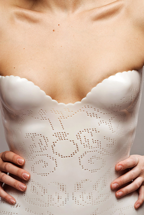
Lanzavecchia-proaesthetics I saw these on Haute Macabre, but it’s turned up on all sorts of design blogs. It’s a line of medical accessories (back braces, neck braces, canes, crutches), redesigned, called ProAesthetics Supports (note_slightly annoying design-ey nav). These are concept pieces for school, and the designer, Francesca Lanzavecchia, is playing with the intersection of body, skin, clothing, and medicine in a positively Ballardian way. Which is cool.

But I hope she takes these designs and finds a way to make them real. Because there are people — particularly teenagers — who are having to wear the ugly versions of these right now, for a short time or for a long time. And they’re dealing with the discomfort, the inability to be ‘normal’, the reactions from peers that range from (at best) bafflement and repeated explanations to (at worst) mockery and humiliation. If they can hide the gear, they are, by avoiding — or at least thinking about avoiding — sports, and showers, and pools. And they’re worrying about how to explain to a girlfriend or boyfriend what that stuff is they’re wearing, and what reaction they’ll get. If they even feel confident enough to snag a girlfriend or boyfriend.

How much better they’d have it if they could pick something out that rocked. That turned something to hide into something to flaunt. Hell, they’d probably get the mockery and weird looks anyway, but at least they’d look damn good. It would make a difference.

Temple Grandin on Technology Transfer

Temple Grandin is an expert in animal behavior and an advocate for people with autism. I'm fascinated by her work — she has, among other things, designed humane animal slaughter facilities — and in particular her use of her own experiences with autism in her work with animals. 

I'm reading Animals Make us Human right now (you can hear her talk about the book on Fresh Air), and one passage stood out for me1. She's talking about technology transfer in agriculture, but everything she says could go just as well in any technical field:

One of the most important lessons I have learned in theirty-five years of designing and installing equipment is that transferring new knowledge and technology from the university to industry often takes more work than researching or creating the design in the first place. The field of diffusion research has many examples of good technologies that failed at some stage of the transfer to the market.

At this point in reading I stopped to add Diffusion of Innovations to my reading list. Grandin then lists four steps to transfer research to business:

  1. Communicate your results outside the research community.
  2. Make sure your early adopters don't fail.
  3. Supervise all early adopters to ensure faithful adoption of the design.
  4. Don't allow your method or technology to get tied up in patent disputes.

That last is both entertainingly specific and familiar to anyone in Silicon Valley — but Grandin is talking about conveyors for slaughterhouses! She gives examples for each step, and this on communicating within your field also resonates:

It's important to publish your research in peer-reviewed journals so knowedge doesn't get lost. But just publishing in journals isn't enough. Researchers need to publicize their work by giving talks and lecture, writing articles for industry magazines, and creating and maintaining websites. One of the reasons I was able to transfer cattle-handling designs to the industry is that I wrote over a hundred articles on my work for the livestock industry press. Every job I did, I published an article about it. I also gave talks at cattle producer meetings, and I posted my designs on my website where anyone could download them for free. People are often too reluctant to give information away, I find. I discovered that when I gave out lots of information I got more consulting jobs than I could handle. I gave the designs away for free and made a living by charging for custom designs and consulting.

Sounds like a good model to me.

[1] Animals Make Us Human: Creating the Best Life For Animals, by Temple Grandin and Catherine Johnson, pages 202-204.

Keep calm and carry on

20090318_0107

Don't keep calm and carry on.

We have this poster, the one on the left, hanging in our kitchen. Apparently we aren't alone in this. I like it, because it reminds me of my family, and because I think

it's the sort of thing it's helpful to see first thing in the morning when the day is smacking you upside the head with its dayness and you haven't had your tea yet.

I'd always thought of it as a poster that was up during The Blitz, but apparently, it was actually held back for use during the expected invasion, which puts a different color on it. (The designer of this poster version also put a

different color on it, of course.) The previous posters in the series read "Your Courage, Your Cheerfulness, Your Resolution Will Bring Us Victory." and "Freedom Is In Peril." I'd be happy with a set of all three.

BoingBoing brings word of a version for today, whipped up in response to the Grauniad article linked above. I like it too. If the artist gets around to selling nice prints in a matching size, I'd be pretty happy with a set of both. But the new one would have to go somewhere where I'd see it after I've had my tea.