Category Archives: Interaction Design

Not Just Unicorns: A Designer Bestiary

Unicorn_hunt_-_British_Library_Royal_12_F_xiii_f10v_(detail)
Illustration of a unicorn hunt; detail of a miniature from the Rochester Bestiary, BL Royal 12 F xiii, f. 10v. Held and digitised by the British Library.

Let’s talk unicorns.

And I’m not thinking of Twilight Sparkle. Legends about the unicorn differ, as is typical with mythical beasts. Some tales describe interaction designers who are also talented visual designers. Others carry news of the rare designer who can also code. And the wildest tales of all describe a designer who is supernaturally capable of anything. These conflicting tales confuse those seeking to hire designers. And of course designers may be asking themselves: “Am I a unicorn, or not?” And since all designers consider themselves magical, if not actually sparkly, the potential for an identity crisis is acute.

A Designer Bestiary

But fret not! Found in a dusty library in a long-forgotten corner of the Bay Area, a tome once thought lost to the centuries has now been found. (It was on display in the bottom of a locked filing cabinet stuck in a disused lavatory with a sign on the door saying “Beware of The Leopard”.) Within it’s pages lie descriptions of a vast assortment of legendary creatures. In a Medieval Bestiary, each entry would describe the characteristics, habits, and nature of a type of creature. Creatures were understood to be both real (if you sailed far enough you might meet one) and allegorical (the story of the Pelican echoes the Bible). Whether the descriptions within A Designer Bestiary are similarly allegorical is disputed by historians and Human Resources professionals alike.

Continue reading Not Just Unicorns: A Designer Bestiary

Tired of mediated online commerce?

Mediated

A few weeks ago, I posted on Facebook that I was “tiring of mediated online commerce.” It was a bit of a flip comment, probably in response to seeing too many headlines about the Groupon IPO, Google Deals, Facebook Deals, etc. I wasn’t entirely sure what I meant, so I had to go back and think about why I responded that way.

INtrospection time! I think serious introspection (deeper than “I like X but not Y”) has become an underused tool for designers & researchers. Yes, we are not always representative of other users — but who is? We are all unique snowflakes! But I know myself really well. And I can ask myself no end of nosy questions without being too intrusive. So, with the obvious & tedious caveat that I may not be representative of other unique snowflakes out of the way, I can forge on.

First point: I can’t be too tired of mediated online commerce, because I buy stuff online, all of which is mediated in some way or other, and often I enjoy it. Accentuate the positive: what online purchases have I made recently that have made me really happy? Turns out there’s a bunch.
Kickstarter

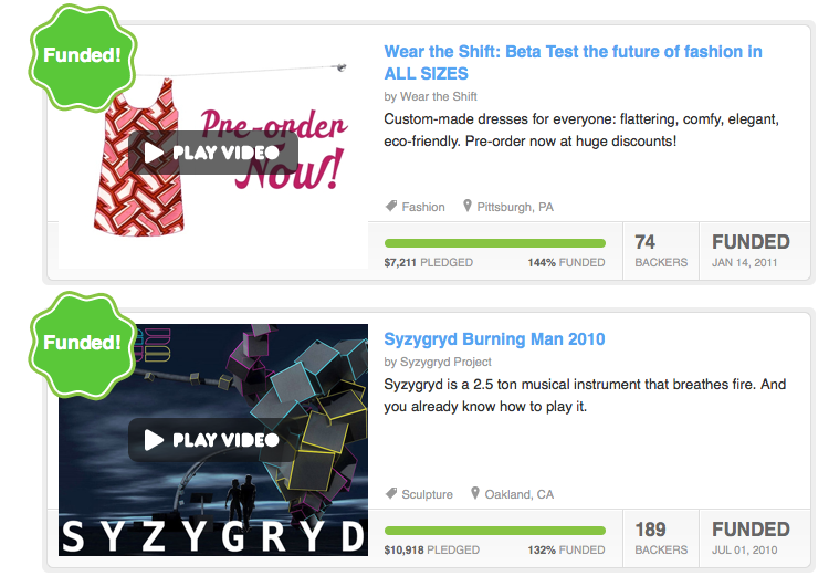
Kickstarter. But wait, you say–kickstarter isn’t e-commerce! Well, it isn’t. It’s a way of funding projects you believe in. And yet … I’ve given money to a bunch of projects. In one case, Syzygryd, I was just helping a bunch of awesome people put together a crazy interactive sound-fire-light-sculpture thing, but I did get a bunch of stickers & a tag. Which I treasure! And in another case my wife beta-tested a custom dress service. Beta-testing was the main point. But in the end we paid money for a nice dress! So in at least some cases, Kickstarter feels like commerce, if of a very particular kind. It is mediated (they handle the money & facilitate communication between funders & the project), but what it feels like is a direct connection between you and a project you believe in. Plus sometimes you get stuff. I love funding Kickstarter projects, and usually feel a great deal of attachment to the ongoing project long after the initial project has finished.
Bandcamp

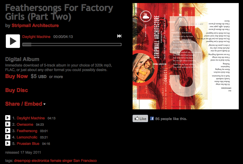
Bandcamp. Definitely commerce. You pays your money, you gets some music. But the experience is pretty similar to Kickstarter — it fosters a very close connection between fan and musician. Often musicians offer different levels of purchase for an album — a cheap download, a CD with packaging for a little more, a deluxe set with a bunch of schwag for even more. Bandcamp also encourages musicians to sell in a “name your price” style — set a minimum price but allow fans to pay more if they like. Which they often do — I usually put in at least a few bucks extra, sometimes more.

Another thing Bandcamp and Kickstarter have in common is fee transparency. It’s very easy for a buyer to figure out what the seller is being charged. If part of your goal is to support an artist or project, not just get a good deal, it’s helpful to know they aren’t getting ripped off.
Airbnb

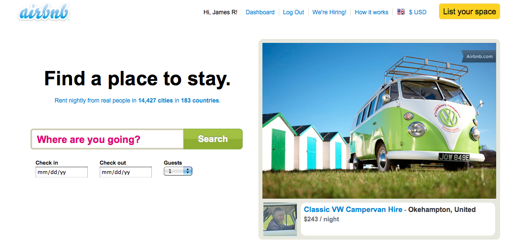
AirBnB. Mediated commerce! Really, it feels like the early days of eBay, when buying stuff from a stranger was new & exciting. Maybe a little risky. In this case you’re renting someone’s room or house — they could be anybody! So making a personal connection with them (as well as looking at reviews & etc.) is a big deal. And, in my case, you find you start reacting to the people you’re thinking of renting from as well as the space. Which is that personal connection thing again.
Betabrand

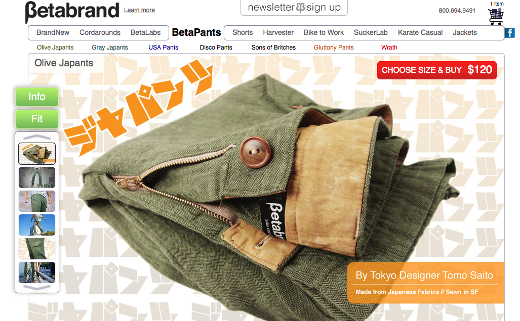
Individual storefronts. I like paying with PayPal for individual merchant storefrontswhen I can so as to avoid creating new accounts or entering credit card numbers. One of my favorites is Betabrand — they have site with a lot of personality. And they make great pants. I’ve been pretty obsessive about unsubscribing from commercial emails lately, but these guys I make an exception for. I’m excited to get an email about new pants. Interestingly, they’re the only case I can think of where display advertising played a psoitive role in a buying decision–I’m not sure I ever clicked on one, but their Facebook ads did keep them in my mind when I decided to go shopping for pants.

A few more:

  • Buying things on eBay old style: vintage auctions! Here I don’t form a personal connection with the maker, but I might form one with the seller. And after all these years it’s still nice to open up a hand-addressed package from a faraway place to find an old Traveller module from 1982.
  • Square. Not online, in person! But really, they’re so dang slick they make getting a receipt fun. And the card case app is intended to make a closer connection with regular in-person haunts.

These are the online (ish) commercial transactions that have made me happy over the last few months. The merchants I’ve done business with these ways are also some of the few for which I haven’t unsubscribed from all emails. (Although in some cases I have unsubbed from the mediating services email — e.g. Airbnb’s.) What do they have in common?

With the exception of some merchants who use Square, they are not regular, day-to-day necessities. These are fun purchases. Not necessarily luxuries (those vintage auctions are cheap if you stay cool), but definitely fun stuff. But I do feel happier about them than, say, buying a few MP3 albums on Amazon.

Why? What do all these transactions have in common?

  • They all represent a real connection with an individual or small company. Whatever services are mediating the transaction, they’re not interfering with that connection.
  • More specifically, my communications are with the individual / project / company, rather than any mediating service. (This is fuzzy, as some services do a bit of “I am sending you an email on behalf of X”. It really comes down to feel.
  • I feel like money is going to the individual or small company I have connected with. I don’t feel like I’m getting a deal at their expense 9this is where fee transparency is helpful).
  • In many cases I feel like I have a stake in the success of the individual / project / company beyond the specific transaction. Even if I never make another purchase, I might want to keep up with what’s going on. I’d feel bad if the company went down or the project was a failure. I’m invested in their success!
  • Individuality. All mediating services place some limits on a merchant’s ability to have a unique experience, but these all do so in fairly limited ways. The more restrictive services (Airbnb, eBay) still let some personality through. PayPal and Square only really limit the payment experience, which is not where most merchants want to show their character anyway. Bandcamp in particular lets musicians customize their pages very heavily, and in fact is happy to have their brand fade into the background and make it entirely about the musician / fan connection.

So, after all that introspection, I guess what I really meant was:

I’m not at all tired of mediated online commerce that helps me make personal connections with vendors, that allows the personality of individual vendors to come through, that allows me to support vendors in monetary and non-monetary ways,  that allows me to communicate directly with vendors, and that helps give me a personal stake in the vendor’s success.

Event: Pig-Faced Orcs at IA Summit 2011

Dandd_gilbert

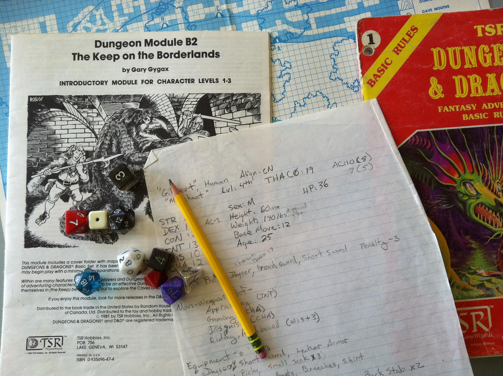
I’ll be giving my newest talk, Pig-faced Orcs: Design lessons from old-school role-playing games at the 2011 IA Summit in Denver Colorado, on Sunday, April 3rd.

You know you want be at a 8:30 AM session to talk about Dungeons & Dragons!

Here’s the spiel:

Pig-Faced Orcs: Design Lessons from Old-School Role-playing Games

Can designers learn anything from old-school role-playing games like Dungeons & Dragons and Traveller? Sure!

Designers of all kinds are getting comfortable applying principles of game design to non-game applications. Many of those principles date back to the early days of role-playing games, from Gary Gygax and Dave Arneson’s first edition of D&D in 1974 to less well-known games like Runequest and Traveller. Game designers have been revisiting these early works and extracting wisdom from them, and I’d like to bring some of those lessons to the user experience community.

In this deliciously nerdy talk, I’ll present user-experience lessons from old-school gaming, including the role of showmanship in constructing an experience, how imperfections and missing pieces can increase engagement, and the difference between sandbox and railroad designs.

I’ll be handing out free 20-sided dice to all attendees.

Addendum: Yep, that’s a real character sheet from when I was about 13. That campaign didn’t have any thieves, but it did have “merchants” …

Slides posted for Oauth, OpenID, Facebook Connect: Authentication Design Best Practices

I've posted slides (and notes) from the talk "Oauth, OpenID, Facebook Connect: Authentication Design Best Practices" I gave at SXSW Interactive 2011. I think it went well—I definitely had fun giving it.

(I'll try to never give a talk with a title that long and awkward again. I get tired just typing it out.)

Event: SXSW Interactive 2011

On March 14th, 2011 I'll be speaking at SXSW Interactive in Austin, Texas. My talk is called OAuth, OpenID, Facebook Connect: Authentication Design Best Practices, but could probably also have been called "What To Do Now That Login Got All Weird."

Here's what I'm going to talk about:

Authentication on the web wasn't simple even when it was mostly usernames and passwords. Now, with 3rd-party authentication services like OAuth, OpenID, and Facebook Connect, creating good user experiences has gotten a little weirder and a little harder. I'll give some examples, and present a pragmatic approach to designing identity and authentication on the web.

Doesn't that sound awesome? If that's not enough, I have a really entertaining digression about the history of "log in". History is cool.

If you're going to SXSWi, please come!

Some pretty random thoughts about Internet stuff

These are unorganized thoughts that are bouncing through my head right now.

  • Facebook and Twitter could become less ephemeral. I first said should not could, but there's a trade-off there. The reason for becoming less ephemeral is to allow users to collect and re-assess their fleeting thoughts and links and conversations for later consideration. The reason not to, of course, is that sometimes you don't want that.
  • On balance, though, I'd rather have it than not. After all, I'm pretty sure that (in some abstracted sense at least), it's being done about my data for other reasons. Why don't I get to play?
  • I'm hearing more about Livejournal from outside the circle of people-who-have-been-using-it-all-along. I doubt it is going to have a renaissance in a business or growth sense, it's more that folks are figuring out some of what was right about  it all along. I tend to think about this in terms of UI details (like putting the "who this post will be exposed to" option very clearly under every post) that emphasize its flexibility on the public / friends / private axes. This person seems to think somehting similar. But it's not just about that axis, there's also something about navigating the line between intimacy (Facebook, at it's best) and publicity (regular blogs).
  • I'm pretty sure that last is at least one reason why Tumblr is taking off as it is. It has really nailed the feeling of connecting intimate communities while also constantly running into new things.
  • I wish it had a "friends-only" post feature, though. That's Livejournal talking again.
  • On a third axis (personal control), I was and am pretty skeptical of the chances of Diaspora's success. But this post on why gender is a text field on Diaspora is one of the finest things I've seen in a long time and pleases me muchly.

On borrowing ideas

If you think you operate in isolation from other designers, gamers, and the culture at large, you're mistaken. And worse, if you don't look at similar problems and systems, you're undercutting your chances of a successful design. You can get creative raw materials this way because, for all creative work, your materials are ideas. This isn't to say you swipe text and settings and so forth. Build up a library of resources that are both close and distant, and learn the options you have.

When you look to use ideas you find useful, it's best to borrow from distant sources; generally speaking, if you are writing a Dungeons & Dragons adventure, then swiping from other D&D adventures makes you a thief, whereas borrowing an element from board games or MMOs makes you smart. Borrowing from much more distant sources like theatre or history makes you a creative genius. Research the field, and then go far beyond that.

— 'The Process of Creative Thought' from The Kobold Guide to Game Design by Wolfgang Bauer

This is not a new thought, but I thought it particularly well stated. I'm reading a lot on game design (both computer and tabletop) right now, and I'm tickled at how applicable most of the ideas are to non-game user experience work.

Of course, that shouldn't be a surprise — the use (and mis-use) of "levels 'n grind" style game mechanics (among many other things) is pretty much a straight descent from Gygax and Arneson in 1974 to fantasy computer games to modern MMOs to the gameofication of software.Not sure what Gary would think of Foursquare, though …

When OAuth Fails: A Visual Guide

If you rely on 3rd party authentication (like OAuth, Facebook Connect, or similar) for your site, or you are planning to, you should spend a little time thinking about what happens if those 3rd parties are unavailable.

Facebook has very good uptime (Twitter somewhat less so, though improving), but very good is not the same as perfect, as a lot of people found out on September 23rd, when they had their worst outage in 4 years. (It’s to their credit that their worst outage was only 2.5 hours long!)

While they were down, I grabbed some screenshots of what happened at sites that relied on facebook Connect for login. The results were interesting.

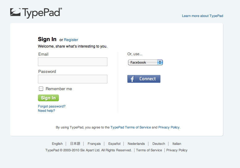
When you log in to Typepad, this is what you’re supposed to see. You can use your Typepad account (if you have one) on the left, or one of many alternatives on the right. The default alternative is Facebook, so Facebook Connect’s button appears:

Typepad_fb_connect

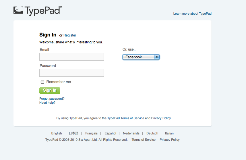
Except, of course, if it doesn’t:

Typepad_fb_connect_down

(Note: I actually still get this on Typepad sometimes, so it’s possible it’s an unrelated issue.)

On Hunch, the button was not an issue (probably because it wasn’t stored on a Facebook server):

Hunch_fb_connect_down


TheFacebook Connect screen the button led to, however, was down completely.

Hunch_fb_connect_down_2


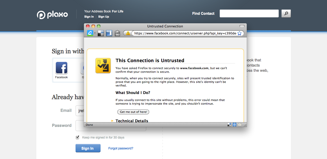
Finally, Plaxo’s Facebook Connect screen gave me this fun warning, which I suspect means I caught it while facebook was in the process of coming back up.

Plaxo_fb_connect_down
What to do?

Well, relying on 3rd parties isn’t new, as anyone who’s worked on a payment flow with a 3rd-party payment processor can tell you. (And this is easier, because you probably aren’t in the middle of a financial transaction.)

You should think through what happens if the service is unavailable (including things like visual assets) and make sure your screen still makes sense to the user.To te extent possible you should try to avoid simply loading blank pages — if you can, detect the outage and give a message to the user. It’s nice if you have alternative means of logging in, but in most cases a simple “wait and try again” would be sufficient.


Pants Pant Pants (a Q&A Comparison)

A pants problem

I had a pants problem, and I turned to the Internet for advice.

And then I turned my pants problem into a practical comparison of some of the different ways to get answers to tricky life questions from the Internet.

A short summary of my problem:

I'm really picky about pants, and having trouble finding pants I like. I'm tired of super-expensive jeans, and khakis and most dressy pants I see are boring.

Does anyone have suggestions for pants that I can wear to the office, that look good, aren't totally boring, and are fairly durable? Easy to clean would be nice, but I can handle dry-cleaning.

I'm totally serious about this question.

Questions and answers

I posted that to Quora, which was the service which got me thinking about question and answer services. (That and my desperate need for better pants.) Quora seemed intriguing, and I keep getting invites from other people, but the questions seemed pretty … limited in scope. It's all very Silicon Valley inward-facing with lots of thinky questions about design process and The State of The Industry and etc. All the questions I came up with on that front seemed pretty artificial, and I wondered how they'd handle a more down-to-earth subject.

Similarly, with Aardvark, I'd done a bunch of answering questions (usually about restaurants in San Francisco, a perennial favorite), and enjoyed the experience, but had never tried asking something myself.

So I decided to use my pants problem to put them to the test.

Continue reading Pants Pant Pants (a Q&A Comparison)

Best email unsubscribe flow ever?

I’ve been on a binge of unsubscribing from various email marketing lists, as an attention cleanser. It makes me feel good. There’s a hierarchy of experience to unsubscribe flows, from the good (clear link in the email, one click to unsubscribe) to the meh (have to hunt to find the link, unsubscribe not the default action on the resulting page) to the awful (you have to log in to unsubscribe, and you’re not sure you even have an account). Some even have some charming copy, but I’d never run into one that was flat out AWESOME until I unsubbed from Etsy’s newsletter.

(Don’t worry, Etsy. I still love you. I just don’t want the newsletter anymore.)

Screenshots below, but honestly, it’s worth subscribing and unsubscribing for the full experience.

Screen 1:

Etsy_unsub_1

Screen 2:

Etsy_unsub_2

Bravo, Etsy!

ETA: Link to the video, because you want to now, don’t you.