Category Archives: Design Theory

Not Just Unicorns: A Designer Bestiary

Unicorn_hunt_-_British_Library_Royal_12_F_xiii_f10v_(detail)
Illustration of a unicorn hunt; detail of a miniature from the Rochester Bestiary, BL Royal 12 F xiii, f. 10v. Held and digitised by the British Library.

Let’s talk unicorns.

And I’m not thinking of Twilight Sparkle. Legends about the unicorn differ, as is typical with mythical beasts. Some tales describe interaction designers who are also talented visual designers. Others carry news of the rare designer who can also code. And the wildest tales of all describe a designer who is supernaturally capable of anything. These conflicting tales confuse those seeking to hire designers. And of course designers may be asking themselves: “Am I a unicorn, or not?” And since all designers consider themselves magical, if not actually sparkly, the potential for an identity crisis is acute.

A Designer Bestiary

But fret not! Found in a dusty library in a long-forgotten corner of the Bay Area, a tome once thought lost to the centuries has now been found. (It was on display in the bottom of a locked filing cabinet stuck in a disused lavatory with a sign on the door saying “Beware of The Leopard”.) Within it’s pages lie descriptions of a vast assortment of legendary creatures. In a Medieval Bestiary, each entry would describe the characteristics, habits, and nature of a type of creature. Creatures were understood to be both real (if you sailed far enough you might meet one) and allegorical (the story of the Pelican echoes the Bible). Whether the descriptions within A Designer Bestiary are similarly allegorical is disputed by historians and Human Resources professionals alike.

Continue reading Not Just Unicorns: A Designer Bestiary

Slides for Pig-faced Orcs: Can designers learn anything from old-school roleplaying games?

Someday I'm going to learn to write short titles.

This talk was ridiculously fun to put together, and even more fun to present. I was surprised (and pleased) to have a chance to play some D&D (4th edition Red Box intro rules) the night before—a perfect warmup.

Many thanks to the fine organizers and attendees of the 2011 IA Summit. It was lovely.

Thinking back over the talk, I think I followed my own advice inadvertantly. Give them something to manipulate—I handed out 20-sided dice to everyone who showed up. Leave gaps & messiness—I didn't have a software example for the last point. The audience supplied great ones, so that worked perfectly.

So, here are the orcs.

Event: Pig-Faced Orcs at IA Summit 2011

Dandd_gilbert

I’ll be giving my newest talk, Pig-faced Orcs: Design lessons from old-school role-playing games at the 2011 IA Summit in Denver Colorado, on Sunday, April 3rd.

You know you want be at a 8:30 AM session to talk about Dungeons & Dragons!

Here’s the spiel:

Pig-Faced Orcs: Design Lessons from Old-School Role-playing Games

Can designers learn anything from old-school role-playing games like Dungeons & Dragons and Traveller? Sure!

Designers of all kinds are getting comfortable applying principles of game design to non-game applications. Many of those principles date back to the early days of role-playing games, from Gary Gygax and Dave Arneson’s first edition of D&D in 1974 to less well-known games like Runequest and Traveller. Game designers have been revisiting these early works and extracting wisdom from them, and I’d like to bring some of those lessons to the user experience community.

In this deliciously nerdy talk, I’ll present user-experience lessons from old-school gaming, including the role of showmanship in constructing an experience, how imperfections and missing pieces can increase engagement, and the difference between sandbox and railroad designs.

I’ll be handing out free 20-sided dice to all attendees.

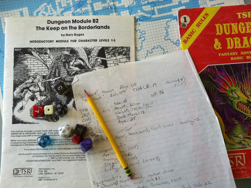
Addendum: Yep, that’s a real character sheet from when I was about 13. That campaign didn’t have any thieves, but it did have “merchants” …

Slides posted for Oauth, OpenID, Facebook Connect: Authentication Design Best Practices

I've posted slides (and notes) from the talk "Oauth, OpenID, Facebook Connect: Authentication Design Best Practices" I gave at SXSW Interactive 2011. I think it went well—I definitely had fun giving it.

(I'll try to never give a talk with a title that long and awkward again. I get tired just typing it out.)

Event: SXSW Interactive 2011

On March 14th, 2011 I'll be speaking at SXSW Interactive in Austin, Texas. My talk is called OAuth, OpenID, Facebook Connect: Authentication Design Best Practices, but could probably also have been called "What To Do Now That Login Got All Weird."

Here's what I'm going to talk about:

Authentication on the web wasn't simple even when it was mostly usernames and passwords. Now, with 3rd-party authentication services like OAuth, OpenID, and Facebook Connect, creating good user experiences has gotten a little weirder and a little harder. I'll give some examples, and present a pragmatic approach to designing identity and authentication on the web.

Doesn't that sound awesome? If that's not enough, I have a really entertaining digression about the history of "log in". History is cool.

If you're going to SXSWi, please come!

On borrowing ideas

If you think you operate in isolation from other designers, gamers, and the culture at large, you're mistaken. And worse, if you don't look at similar problems and systems, you're undercutting your chances of a successful design. You can get creative raw materials this way because, for all creative work, your materials are ideas. This isn't to say you swipe text and settings and so forth. Build up a library of resources that are both close and distant, and learn the options you have.

When you look to use ideas you find useful, it's best to borrow from distant sources; generally speaking, if you are writing a Dungeons & Dragons adventure, then swiping from other D&D adventures makes you a thief, whereas borrowing an element from board games or MMOs makes you smart. Borrowing from much more distant sources like theatre or history makes you a creative genius. Research the field, and then go far beyond that.

— 'The Process of Creative Thought' from The Kobold Guide to Game Design by Wolfgang Bauer

This is not a new thought, but I thought it particularly well stated. I'm reading a lot on game design (both computer and tabletop) right now, and I'm tickled at how applicable most of the ideas are to non-game user experience work.

Of course, that shouldn't be a surprise — the use (and mis-use) of "levels 'n grind" style game mechanics (among many other things) is pretty much a straight descent from Gygax and Arneson in 1974 to fantasy computer games to modern MMOs to the gameofication of software.Not sure what Gary would think of Foursquare, though …

Lessons from designing role-playing game adventures

I was reading James Maliszewski's interview of Paul Jacquays*, and came across this bit:

10. Are there any lessons you've
learned from working in the computer game field that you think ought to
be applied to tabletop RPG design?

Provide more than one
solution to encounters, if only to be willing to accept the other
solutions that your players devise.

Take into consideration your
players' (not their characters') skills and ability to understand 3D
space when creating or choosing adventures. Don't throw new players into
complex 3D settings. Mapping and understanding one's position inside
3D space can be challenging even for skilled players. Start "flat" and
work them up to spaces with more complicated vertical relationships.

Create
spaces that could work in the real world. Walls have thickness. Large
open interior spaces have to be supported by columns to be believable.
As a fantasy illustrator, I learned to engage the viewer's suspension of
disbelief by creating realistic, believable environments which would in
turn lend their reality and believability to the fantasy elements found
within. Designers need to do the same thing … engage the players'
suspension of disbelief just long enough to convince them that game
situations are grounded in things that could happen.

Give your
players "save spots" in your gaming sessions, natural breaks in the
adventure where they can pull back, regroup, return to base, etc.

Finally,
don't overwork the game's backstory. Less can be more, so write as
little as you can to convey it. I emphasize this to the content
designers on my own project teams. Your players will appreciate that you
are creating plot and character links, but could probably care less
about detailed ancestries, hidden motivations, or involved descriptions
of locations and events that they will never encounter. They just want
to hit things and move on. Don't make success in your game depend on
reading multiple paragraphs of stilted description or dialogue.

I don't think it's too crazy a stretch to apply these lessons to design outside of a game context altogether.

*James Maliszewski is a somewhat-old-school RPG designer and author of the old-school gaming blog Grognardia. Paul Jacquays is a really-old-school game designer.

“The age of surplus pixels”

I keep coming back to this short post by Russell Davies. (No, not that Russell Davies.)

By way of reexamining Being Digital and Pointcast, he says:

But we're about to enter an age of surplus pixels – screens sitting
there, resting, not showing much, perhaps the odd slide show, screens
that aren't the thing we're doing. In public spaces, in offices, in our
homes. iPads and iPad-killers are going to be sitting around our living
rooms, next to our desks, next our beds. And we'll soon want more on
there than our picture libraries Ken Burnsing slowly away to themselves.
But we're going to want less than most designers are inclined to
design. We'll need a restful, slow, quiet sort of
information/entertainment design. Stuff that's happy not to be looked at
that much. That'll be interesting.

This makes a lot of sense to me, and triggers a bunch of reactions, not all well thought-out.

  • I really, really like the idea of "restful, slow, quiet" design. I'd like to see more of it in the digital realm. I love garish and loud as much as the next person, but the eyeballs, they get tired.
  • What are the print equivalents of restful/slow/quiet design? What are the architectural equivalents? Is this a call for the digital equivalents of the arts and crafts movement?
  • (Is that why we're seeing so many fake wood-grain apps on iDevices? I'm not sure William Morris would approve: plopping wood imagery on silicon/glass/aluminum devices is hardly "truth to material".)
  • Dragging this post back to the subject at hand, my fear is that instead of restful/slow/quiet, we'll get twitchy/fast/loud, particularly in the form of ads/ads/ads. We've already got extra screens at the grocery store (ADS!) and the gas station (ADS!) and there's talk of adding some to license plates (ADS!).
  • The opposite of an arts and crafts approach to all the surplus pixels, then, is a cyberpunk-style dystopia where behaviorally-targeted ads follow you from screen to screen down the street jabbering at you incessantly until you go postal. So that wouldn't be good.
  • Which in turn brings to mind projects like this LCD TV zapper kit as one possible response.
  • A pretty safe prediction (based on our culture's track record so far) is that which types of screens you see will split on class lines. In the same ways it does already, money will buy peaceful and tranquil spaces for those that have the money, and the twitchy/fast/loud will dominate mass culture.

Temple Grandin on Technology Transfer

Temple Grandin is an expert in animal behavior and an advocate for people with autism. I'm fascinated by her work — she has, among other things, designed humane animal slaughter facilities — and in particular her use of her own experiences with autism in her work with animals. 

I'm reading Animals Make us Human right now (you can hear her talk about the book on Fresh Air), and one passage stood out for me1. She's talking about technology transfer in agriculture, but everything she says could go just as well in any technical field:

One of the most important lessons I have learned in theirty-five years of designing and installing equipment is that transferring new knowledge and technology from the university to industry often takes more work than researching or creating the design in the first place. The field of diffusion research has many examples of good technologies that failed at some stage of the transfer to the market.

At this point in reading I stopped to add Diffusion of Innovations to my reading list. Grandin then lists four steps to transfer research to business:

  1. Communicate your results outside the research community.
  2. Make sure your early adopters don't fail.
  3. Supervise all early adopters to ensure faithful adoption of the design.
  4. Don't allow your method or technology to get tied up in patent disputes.

That last is both entertainingly specific and familiar to anyone in Silicon Valley — but Grandin is talking about conveyors for slaughterhouses! She gives examples for each step, and this on communicating within your field also resonates:

It's important to publish your research in peer-reviewed journals so knowedge doesn't get lost. But just publishing in journals isn't enough. Researchers need to publicize their work by giving talks and lecture, writing articles for industry magazines, and creating and maintaining websites. One of the reasons I was able to transfer cattle-handling designs to the industry is that I wrote over a hundred articles on my work for the livestock industry press. Every job I did, I published an article about it. I also gave talks at cattle producer meetings, and I posted my designs on my website where anyone could download them for free. People are often too reluctant to give information away, I find. I discovered that when I gave out lots of information I got more consulting jobs than I could handle. I gave the designs away for free and made a living by charging for custom designs and consulting.

Sounds like a good model to me.

[1] Animals Make Us Human: Creating the Best Life For Animals, by Temple Grandin and Catherine Johnson, pages 202-204.

Design and managing risk

Ever thought about hanging out your own shingle? If so, you’d better think about how you’ll handle health insurance. If you’d be covered through a spouse’s insurance, you’re probably set, but otherwise you might have to buy individual health insurance, which typically costs more. And that’s if you’re lucky enough to get individual health insurance, since it could be denied to you for all sorts of reasons — from serious prior conditions to minor ones like allergies, ear infections, or joint sprains. Or because you’d been a lumberjack or carnival worker. (Here’s a list of over 50 reasons health insurers may reject you. It’s scary stuff.)

Jacob Hacker talks about healthcare as one type of increasing risk for folks in the US in his book The Great Risk Shift, along with retirement and jobs. It’s a great book, full of meaty policy goodness (if you like that sort of thing), but the basic point is simple: in some important ways, Americans are at greater risk of dramatic swings in income, prolonged job loss, massive healthcare costs, and other forms of economic insecurity than in the past. For example, he states that "The chance that a person with average demographic characteristics will
experience a 50 percent or larger drop in income over a two-year period
has risen from 7 percent in the early 1970s to 17 percent in 2002." So it’s not just healthcare risks we have to worry about. He goes on to talk about both the causes of this shift and some possible policy solutions, and I hope we’ll hear more about some of those solutions as the various presidential campaigns start heating up.

So, what does this have to do with design (other than discouraging design entrepreneurs starting their own consultancies)? Well, while actually fixing the problems probably requires national policy changes, those can take a while. In the meantime, we can think about designing products and services that can help folks at least manage these risks.

I first started thinking about this when Scott Cook, founder of Intuit, came to talk to the product team at eBay a while ago. He’s a pretty engaging speaker, and frames the history of the company as a series of products inspired by deep customer insights — insights which he cheerfully admits they came to very late in some cases. One such case was the origin of Quickbooks — for many years Intuit researchers noticed that a significant number of Quicken users seemed to be small businesses. This didn’t make any sense, as it was designed for home financial use, not accounting — until they eventually realized that there was a need for small business accounting software designed for non-accountants.

I was intrigued by his mentioning, as a similar case, a new software product created specifically to manage health insurance paperwork Quicken Medical Expense Manager. It turns out that the inspiration for this came from even closer to home, as this story (PDF) relates:

Dan Robinson’s life changed forever in the winter of 2000. His newborn son entered the world with a rare illness that required a life-saving heart surgery — the first of many, it would turn out — when he was just two months old …

At the time of his son’s birth, Dan was an engineering manager with the Quicken team and Intuit Inc. As the parent of a child with a serious medical condition, he experienced firsthand how stressful managing medical expenses can be.

By 2001, the Robinson’s medical bills exceeded $1.2 million. "I felt overwhelmed by the number of bills and statements — I was unable to make sense of it all, Robinson said …

Robinson developed his own basic medical expense management  software program and proposed a more formal software solution to the Quicken organization for development.  At first his ideas was met with skepticism, but eventually he was given the go ahead to pursue it.  The premise was simple: develop a product that could help track  healthcare expenses and insurance for individuals and families.

I think this is an amazing example of product design targeting a real and scary risk (the risk of bankruptcy due to overwhelming healthcare costs) and helping empower individuals to manage that risk. Product designers have a tendency to talk about what good things using their product will do for their customers — but sometimes the  best path is to help  manage risks, i.e. reduce the likelihood of bad things happening.

Edit: My friend Karen posted about this subject (and dictators and complex systems) a little while ago.