I’m James Reffell. I help teams create experiences that build businesses and change lives.
Below are a few significant design projects I’ve worked on.
Auction.com (now Ten-X)
Ten-X (Formerly Auction.com) is a platform for investors to buy & sell real estate. In 2015, as Director of Product Design and hands-on designer, I led a comprehensive redesign of the site with two goals:
- Upgrade Auction.com’s web experience.
- Frictionless buying for investors.
I coordinated the effort as a whole, and my team split the redesign, each of us taking a different set of features . In parallel we developed Auction.com’s first design system.
I focused on the auction registration flow. This flow was a key driver of our core metric, the number of bidders per asset. The existing flow was a usability nightmare that had accumulated over years. I removed friction in the flow by reducing complexity, organizing the required elements, and using standard form elements from our newly developed design system. I also added contextual help for first-time bidders.
All design changes were heavily user-tested with real estate investors using a working prototype to ensure the design changes met our goals.
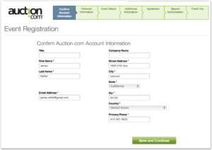
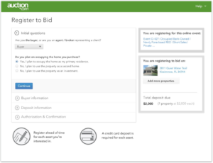
The final result launched in the spring of 2015 and caused a 20% increase in bidders per asset.
Plaxo
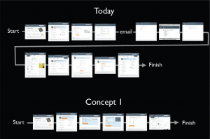
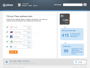
In 2010, Plaxo (plaxo.com) brought me on for a project to analyze and help redesign their first- time experience. Plaxo knew that users who imported two or more address books (from Google, Yahoo, mobile phones, etc.) during their first-time experience were considerably more likely to stick around and be active, and even paying, customers. The goal of the redesign was to increase the number of successful signups in general and (more importantly) the number of successful signups with 2 or more imported address books. My role in the project included analyzing the existing experience, creating concept designs for a new experience, and creating flows and mid-fidelity wireframes for key screens.
“James worked with us to reshape our on-boarding flow at Plaxo to reflect the pivot in the business. His design leadership was instrumental in developing a more effective framework which, in its first phase, saw a 30% increase in our conversion rate. I also found the foundation that he laid during his engagement something that we continued to build upon over the years—compounding the initial ROI. I’d work with James again in a heartbeat!”
– Preston Smalley, then General Manager and Head of Product at Plaxo
You can read more about my work with Plaxo in this case study.
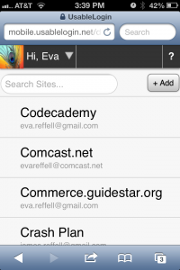
Usable Security Systems
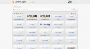
Usable Security Systems was a small startup with a big mission: fix passwords forever. Armed with funder Rachna Dhamija’s research into security and usability, we combined the best of both worlds in an extremely simple, flexible, and intuitive password manager, UsableLogin. As Principal Designer, I refined the early prototype designs into a mature product that included a web dashboard, browser extensions, and mobile (web, iOS and Android) experiences. Usable Security Systems was later acquired by Webroot, where we continued refining the product.
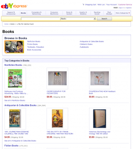
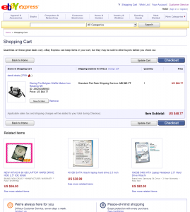
eBay Express
eBay Express launched in 2006. Conceived as a fully separate experience from eBay, we designed it from the ground up to focus on fixed-price listings from trustworthy sellers–something much more like other e-commerce sites than the core eBay experience. I worked on the early conceptual designs and led the full design effort (interaction design, visual design, and copy) as we refined, built, and launched it. eBay Express closed in 2008–you can read the full story here–but the design and product processes we developed during its creation became the internal best practice for later projects, such as the relaunch of eBay Motors.

